
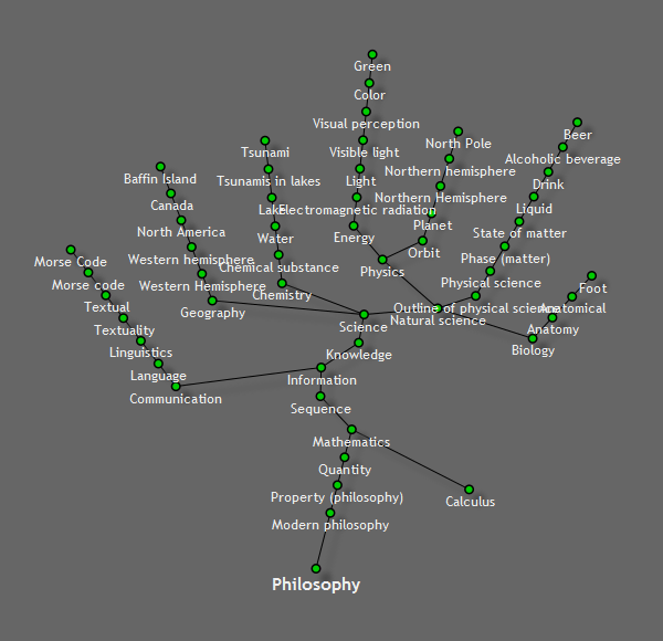
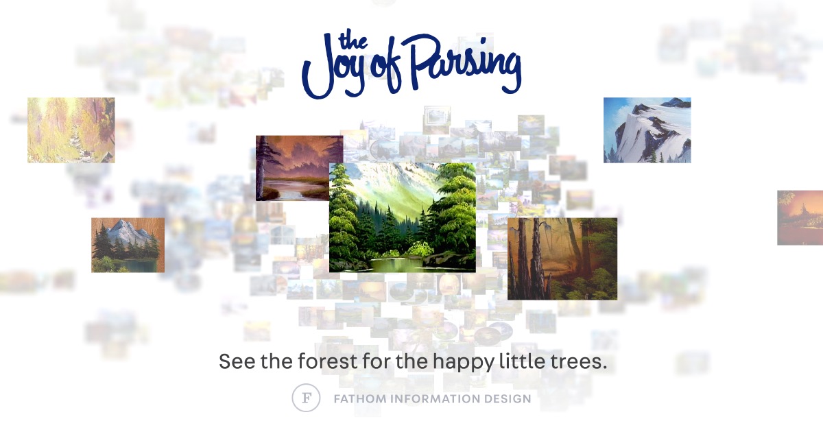
Amazing Visualization Projects/Tools
List of cool project that have awesome visualization of all sorts of data! openmappr,

List of cool project that have awesome visualization of all sorts of data!
openmappr
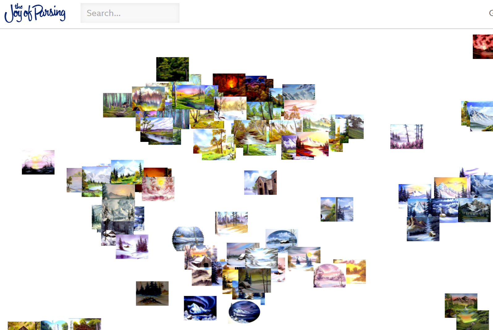
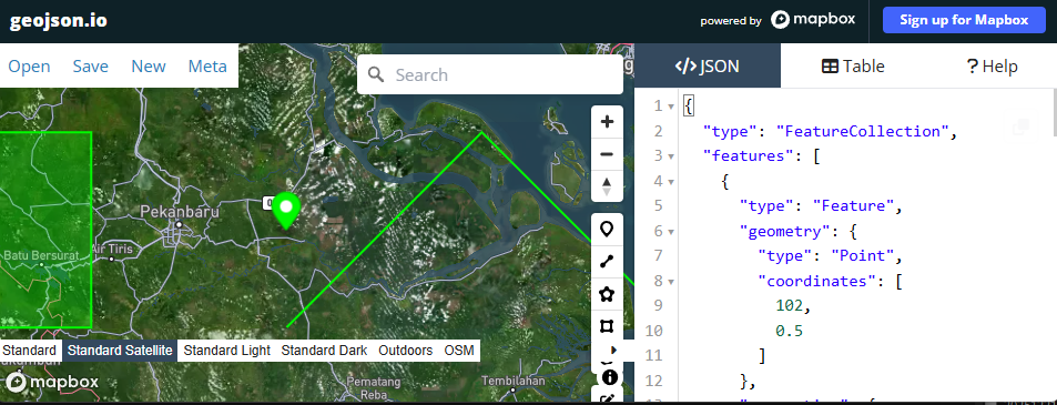
openmappr - explore networks
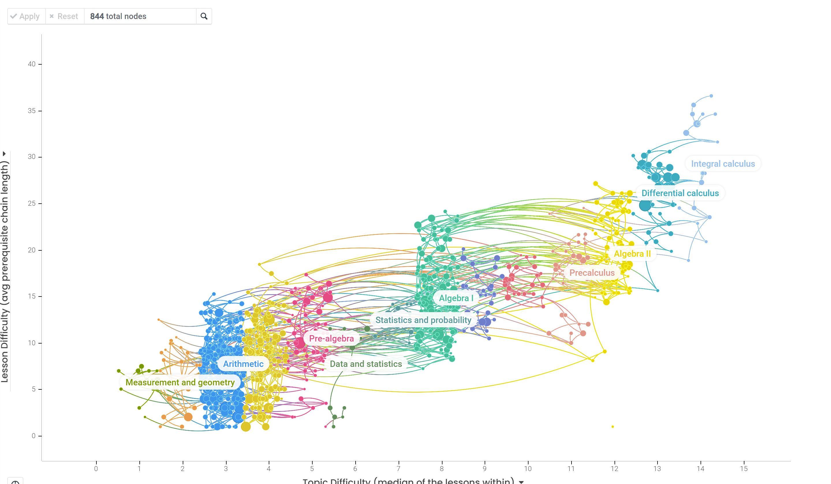
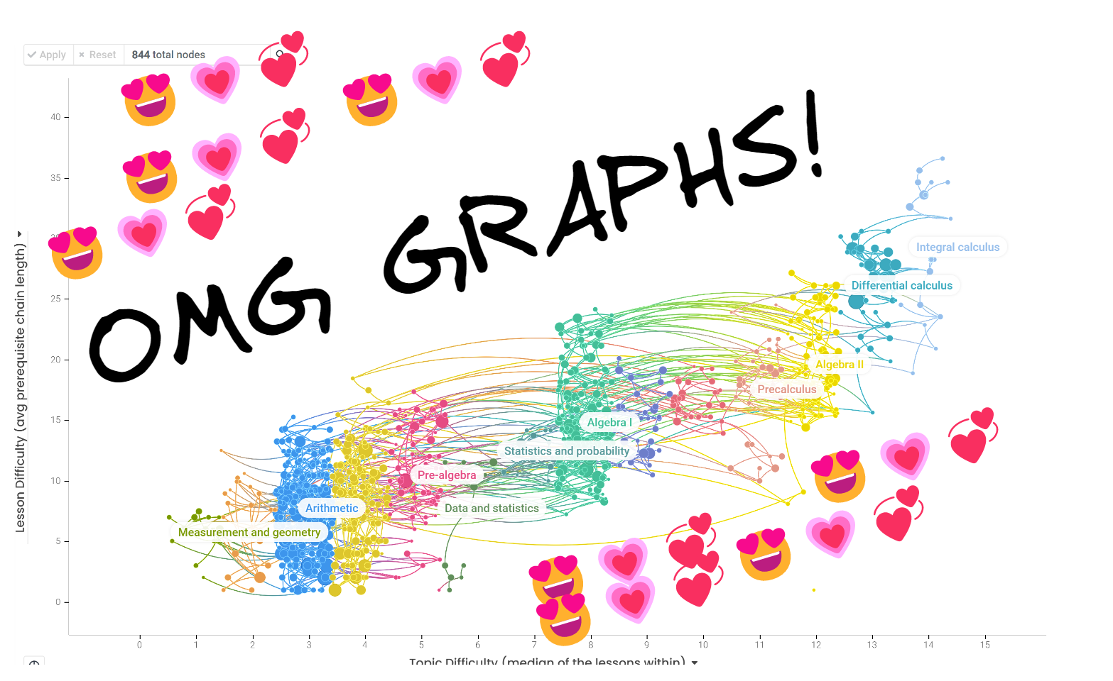
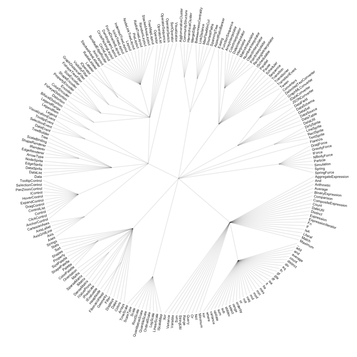
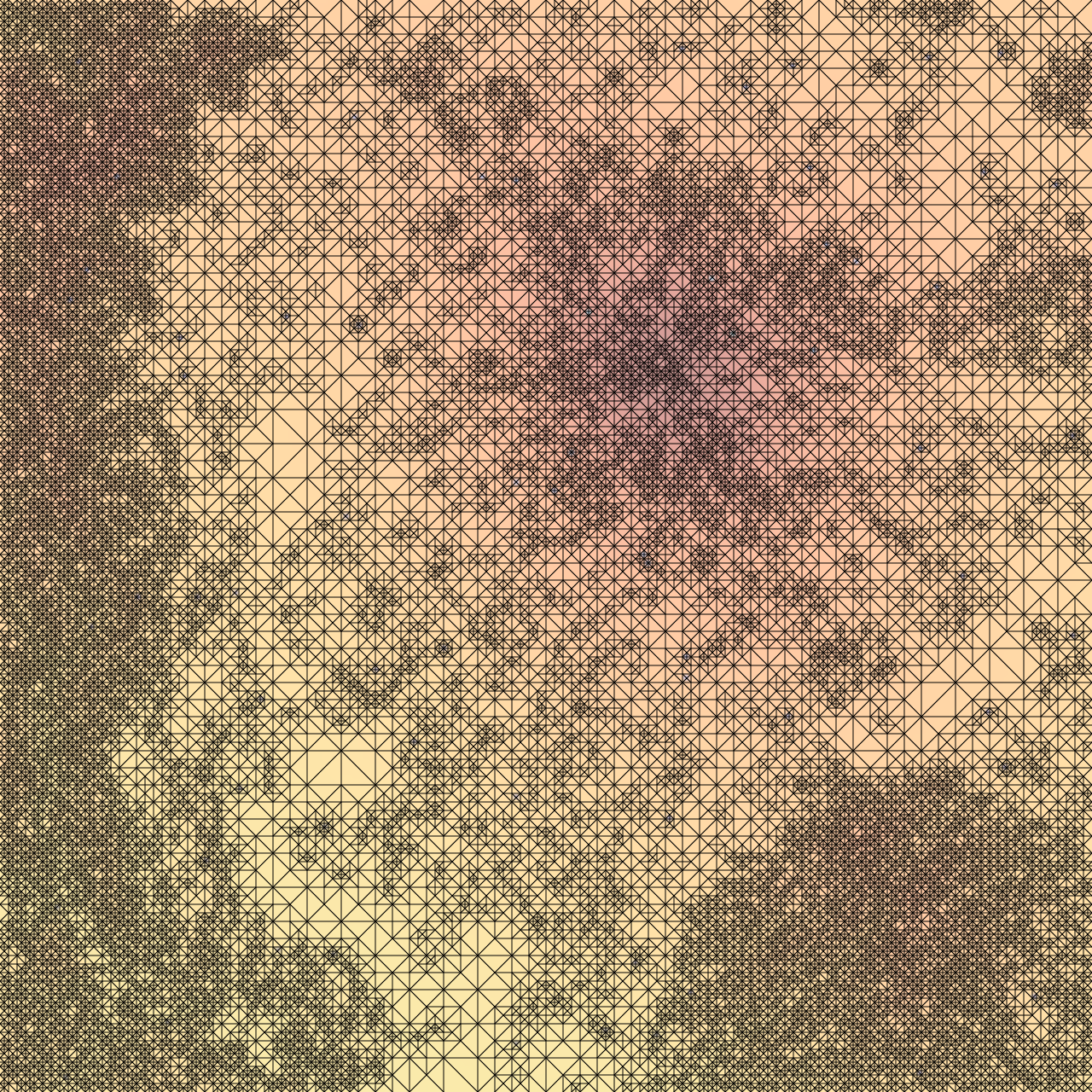
Graph of difficulty of learning math concepts. Source Khan Academy
link https://openmappr.com/play/KhanAcademy
Cool links
https://openmappr.com/play/misinfo_vulnerability
Ted talk about it
data to viz
this one deserves a web oscar!
It helps anser the question, "what type of graph best repersents my dataset?"
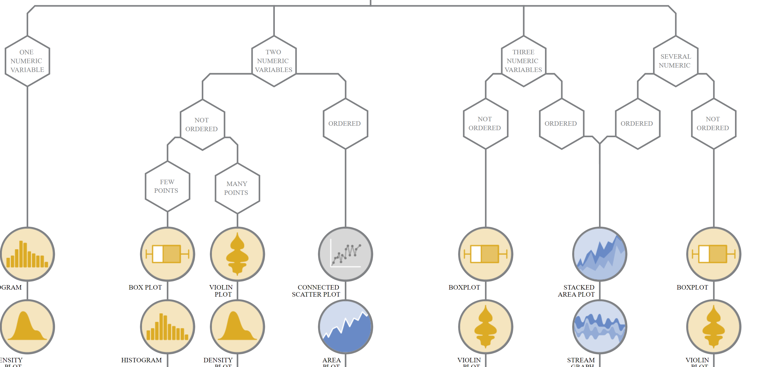
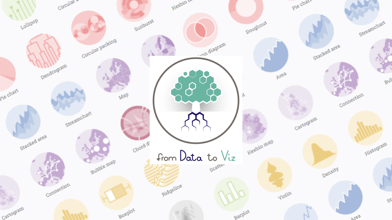
Its super cool and really worth checking out!
also checkout this blog post by same people

Xefer
Wikipidea + 7 degrees to keven bacon + steroids = 💎OMG
Its a way to visually and logically link 2 pages on wikipidea to one another
Link to app
I made a blog post about this tool
Data visualization: How math terms relate to each other
 Oran C
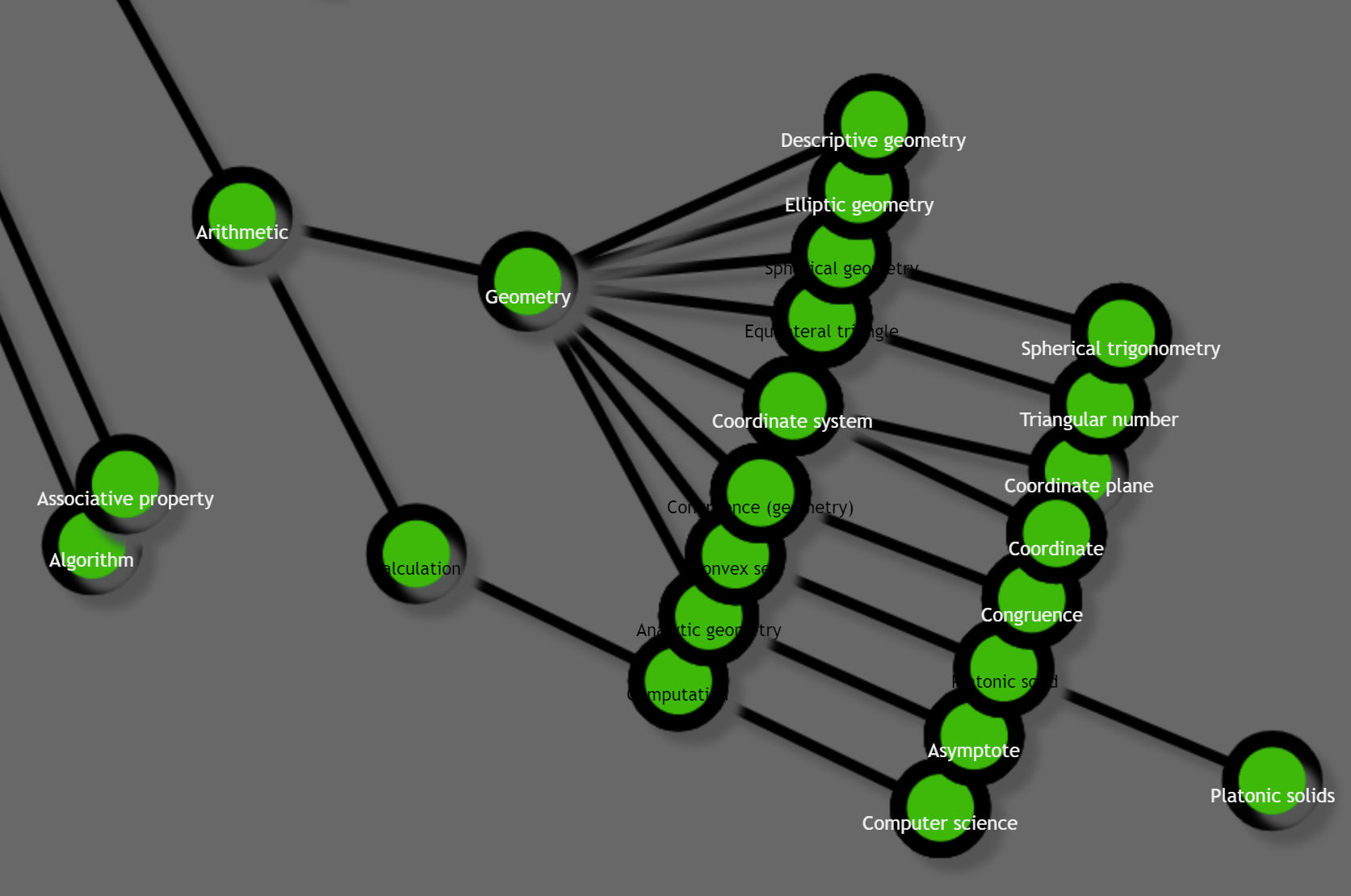
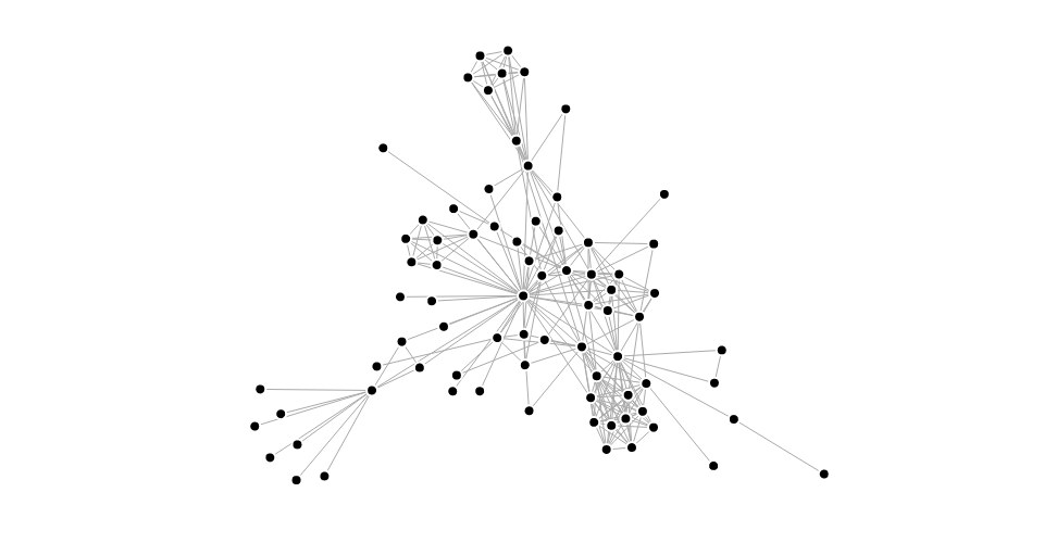
Ego4d
not a tool, it's just cool
this a visualization of this masive 5tb machine learning training dataset
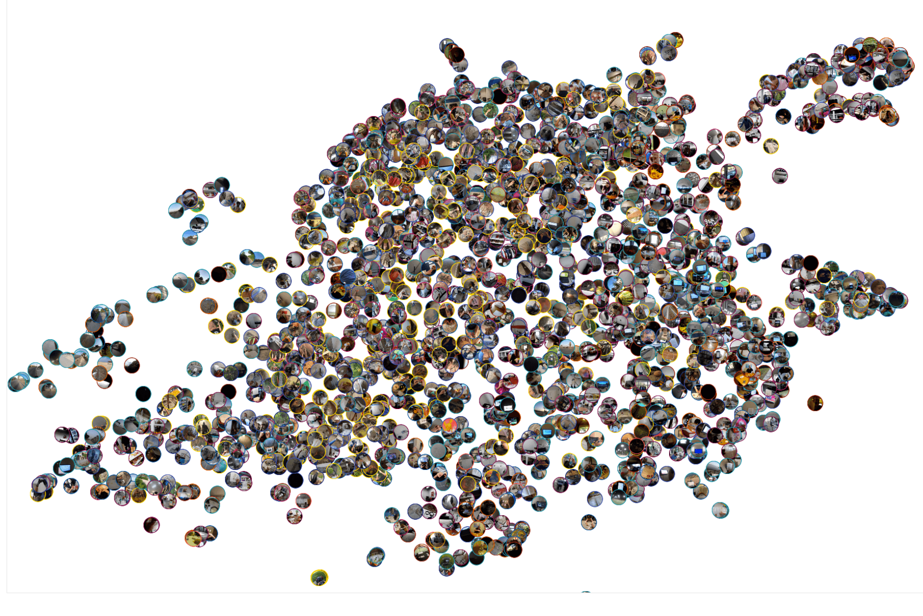
Also made a blog post, if youve read this far youve probilbly sensing a theme here..😋
Oran C
Observable
and everything made by Mike bostock EVER!
Observable has the most amazing visualization on the web. and most of them are made by mike bostock
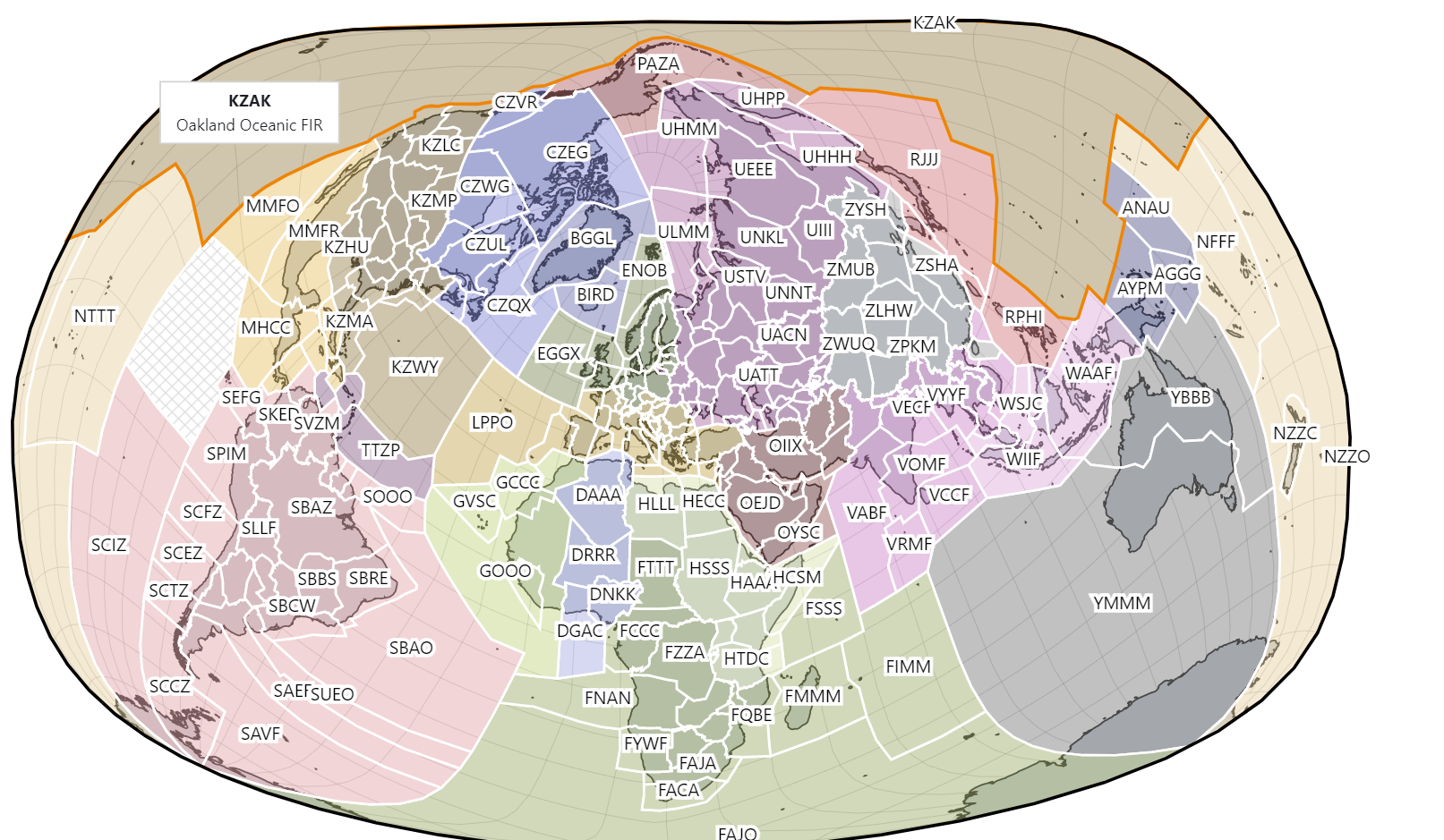
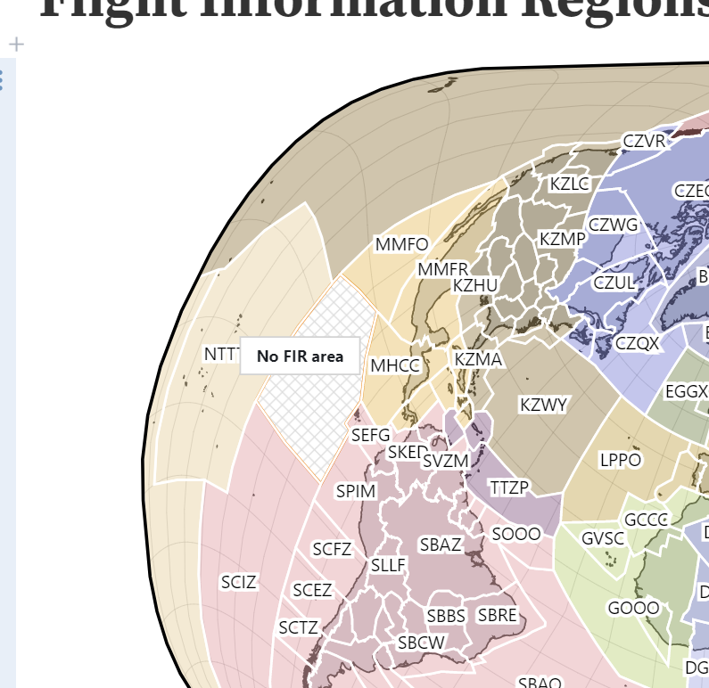
Flight Information Regions
MARTINI: Real-Time RTIN Terrain Mesh
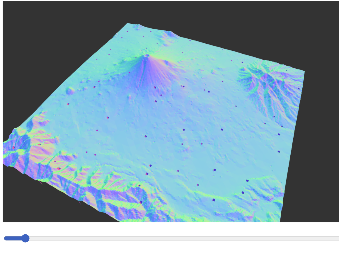
https://observablehq.com/@mourner/martin-real-time-rtin-terrain-mesh
#Baller-map-maker
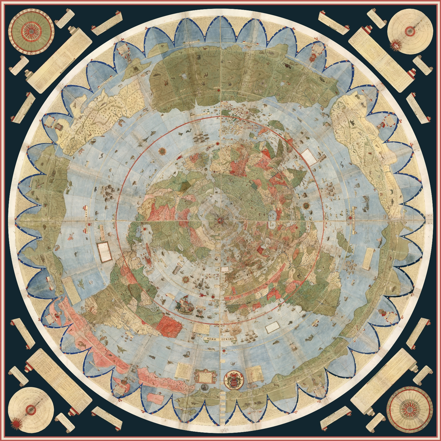
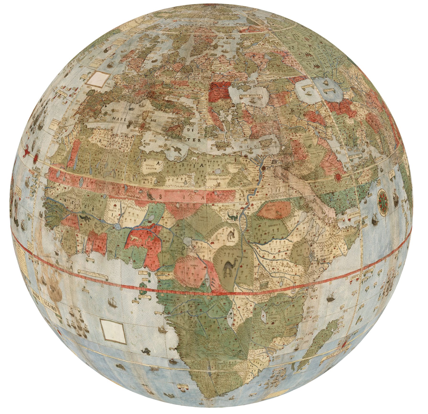
Urbano Monti’s Planisphere (1587) / Jeremy Ashkenas / Observable
https://observablehq.com/@jashkenas/urbano-montes-planisphere-1587?collection=@observablehq/maps
Here's the same old ass map, projected onto a cyhper.
What makes this map super impressive is when it was made: 1587. before computers, planes, gps! all done by hand!
Live zoomable map link bellow
https://observablehq.com/@jashkenas/urbano-montes-planisphere-1587?collection=@observablehq/maps
Projection Transitions
Ever wondered how map projections work?
here's a cool visualization that allows you to play with the different projection map's

https://observablehq.com/@d3/projection-transitions?collection=@d3/d3-geo
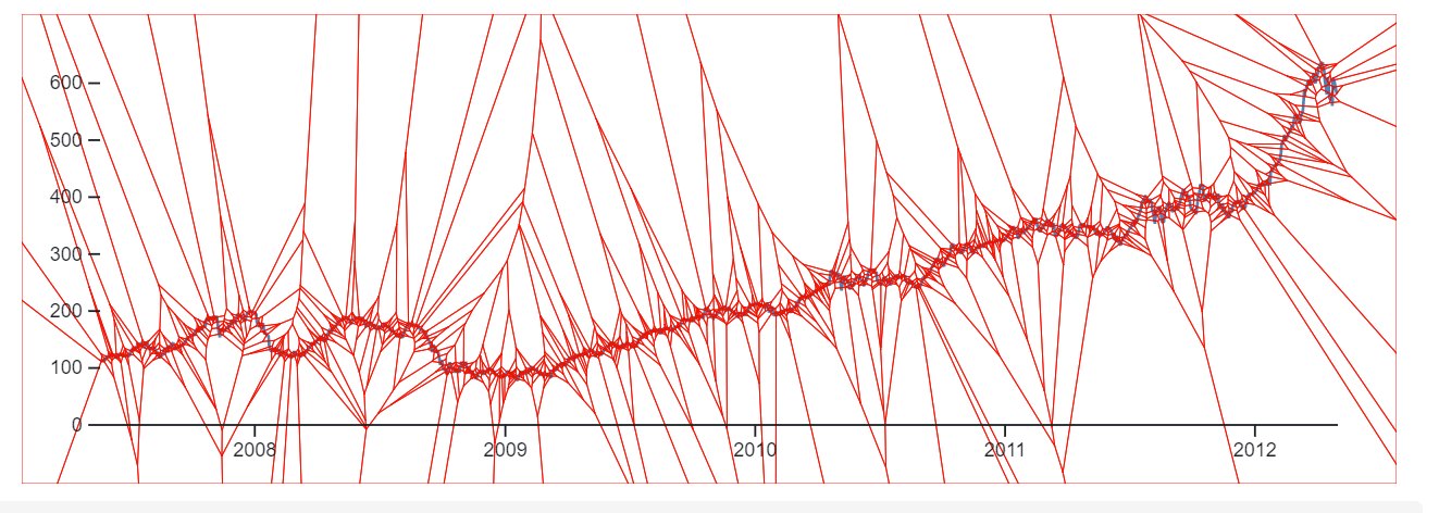
delaunay.find
finds a point in a Delaunay triangulation.
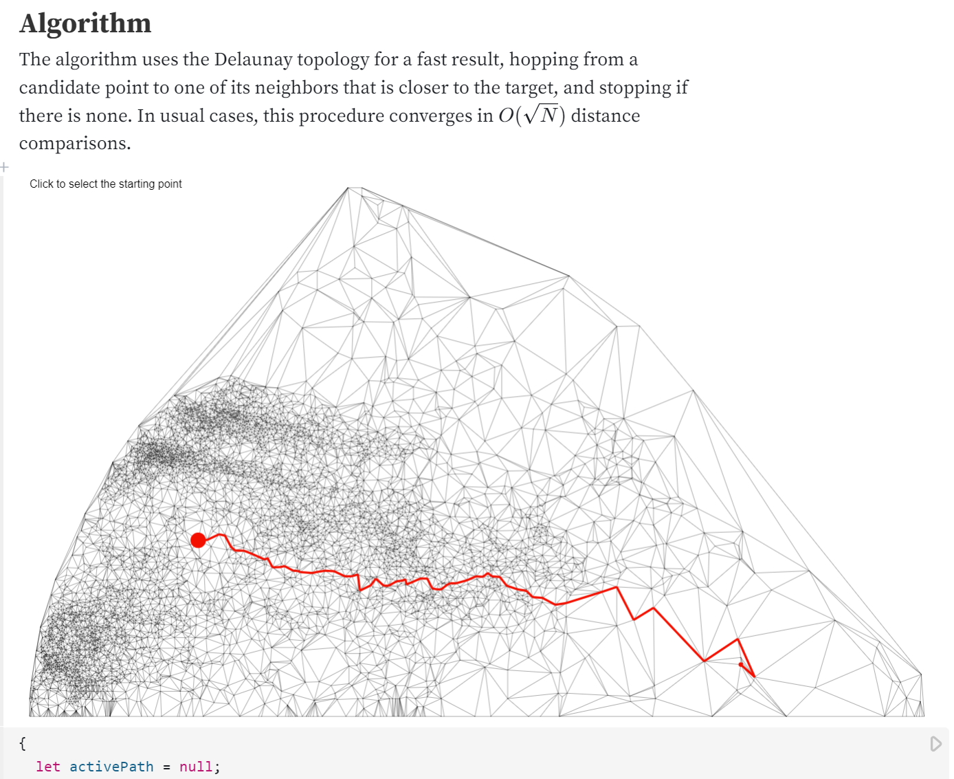
https://observablehq.com/@d3/delaunay-find?collection=@d3/d3-delaunay
voronoi.neighbors
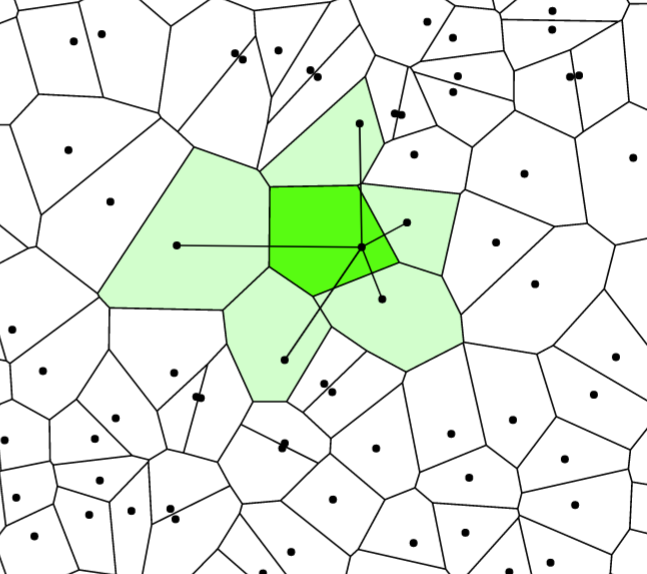
Same thing just with more interaction

https://observablehq.com/@d3/hover-voronoi
Compute the Voronoi diagram of a set of two-dimensional points.
Select a one- or two-dimensional region using the mouse or touch.
Pan and zoom SVG, HTML or Canvas using mouse or touch input.

Drag and drop SVG, HTML or Canvas using mouse or touch input.
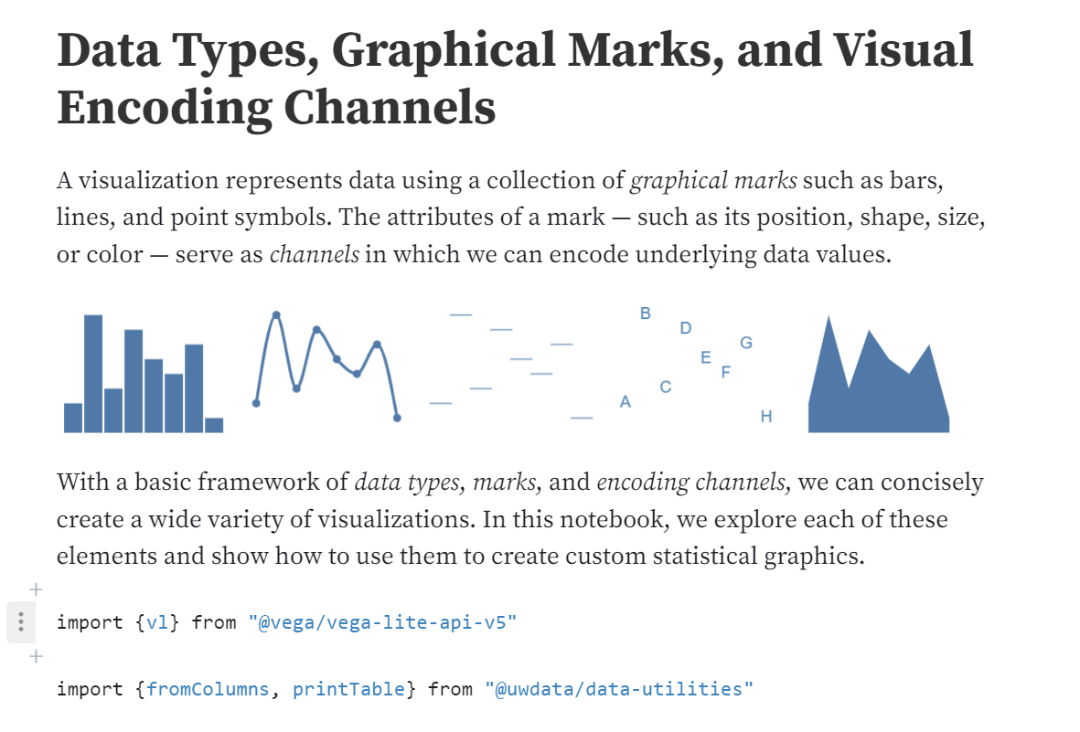
Data Types, Graphical Marks, and Visual Encoding Channels
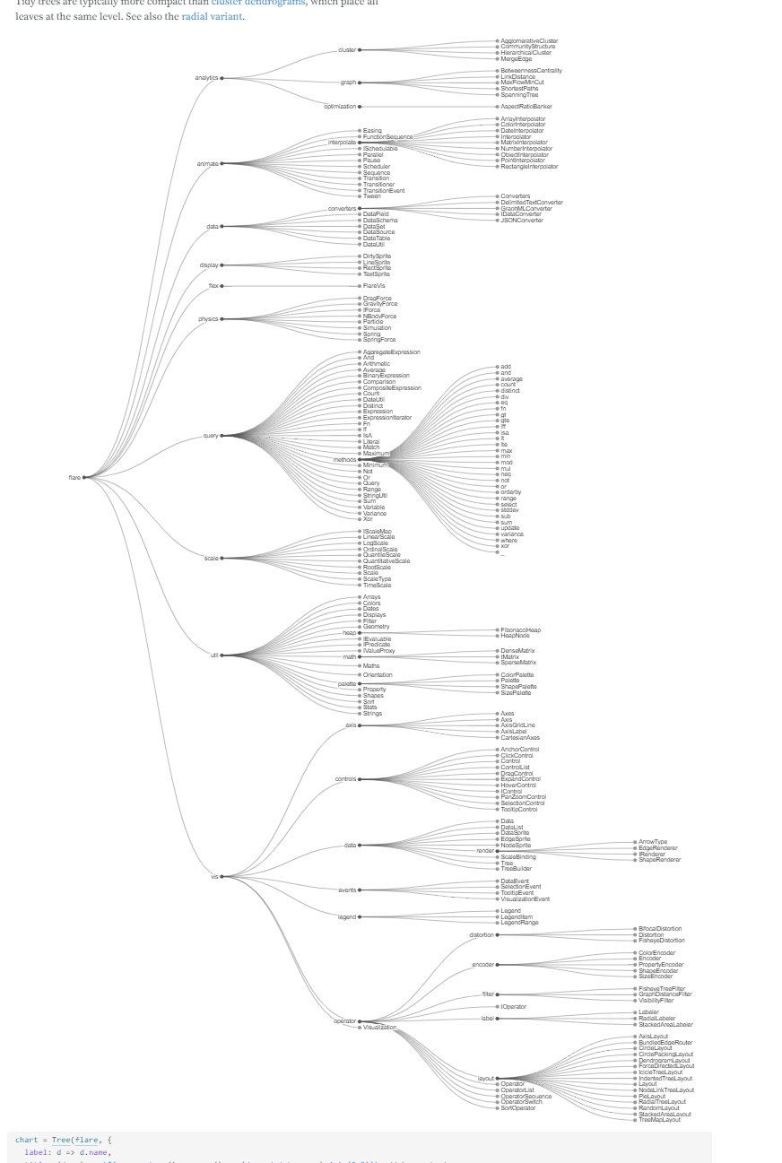
Tree, Tidy
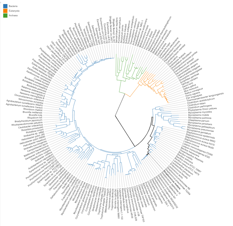
Tree of Life
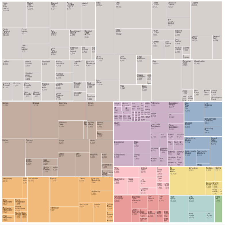
Treemap
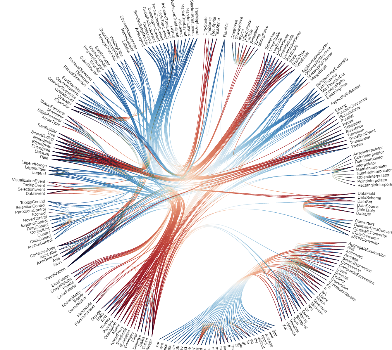
Hierarchical Edge Bundling
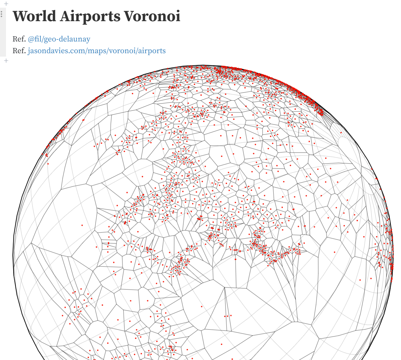
World Airports Voronoi
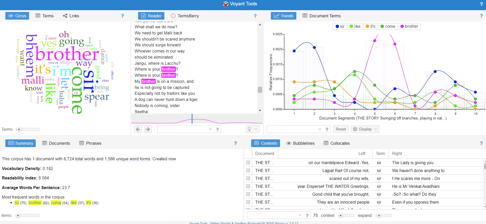
amazing Language analysis tool
Voyant Tools

Voyant Tools is a web-based reading and analysis environment for digital texts.
tag: owl language processing
Random ones
zipdecode | ben fry
Joy of parsing

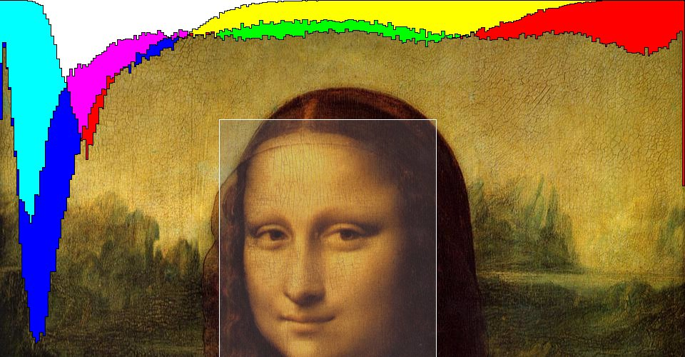
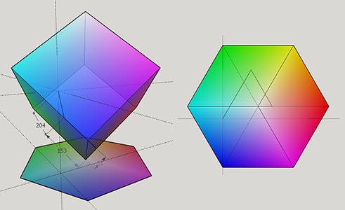
color space is actually a projection map of a 3d cube!
this an amazing visualization done by someone answering a stackoverflow post! worth a read/glance

Windy: Wind map & weather forecast

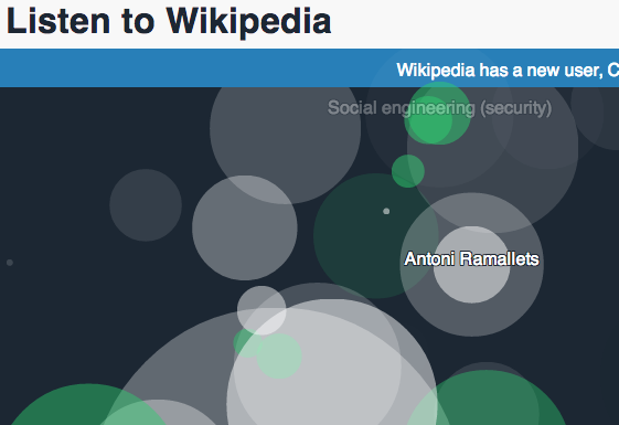
Wikipidea visualizations

live version
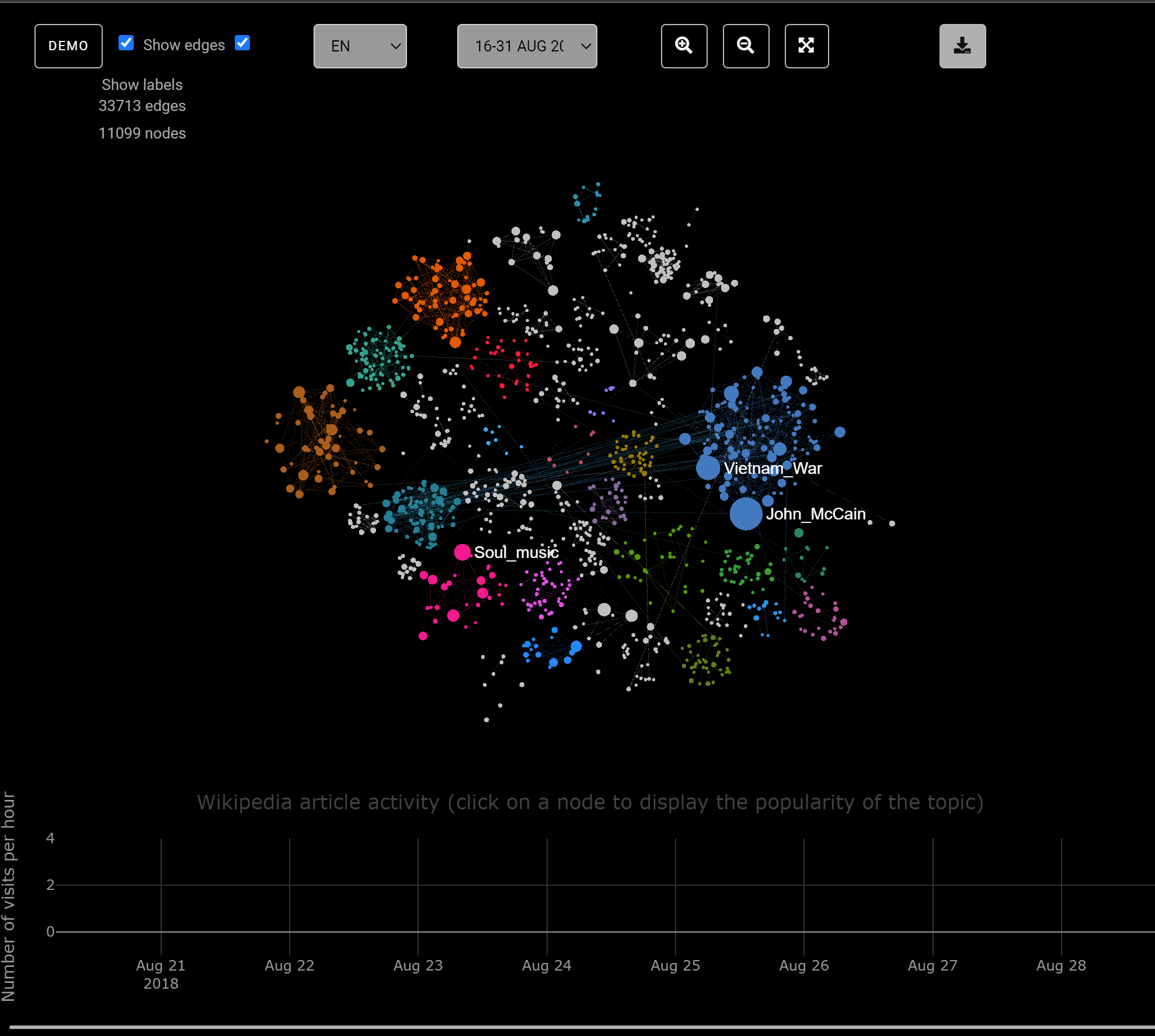
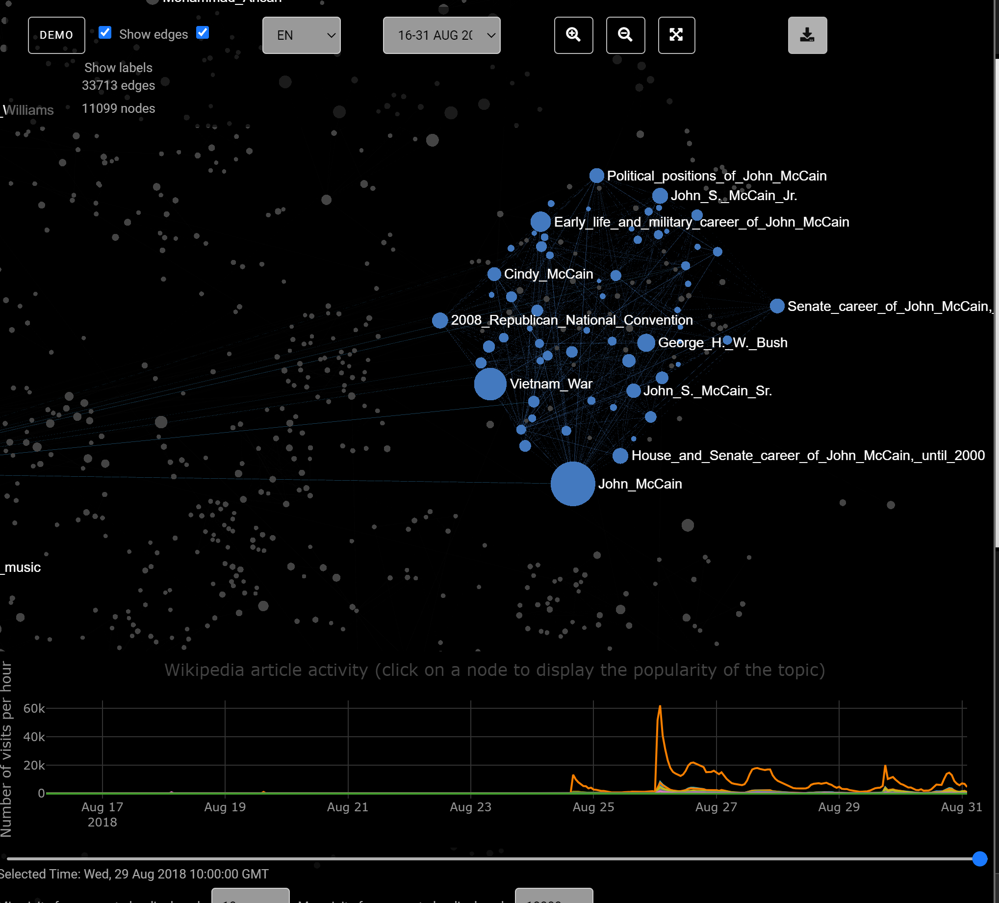
histography
one of the most intesting visualizations ive seen, its great at showing large amounts of data and tells a story. It uses wikipidea data as its source
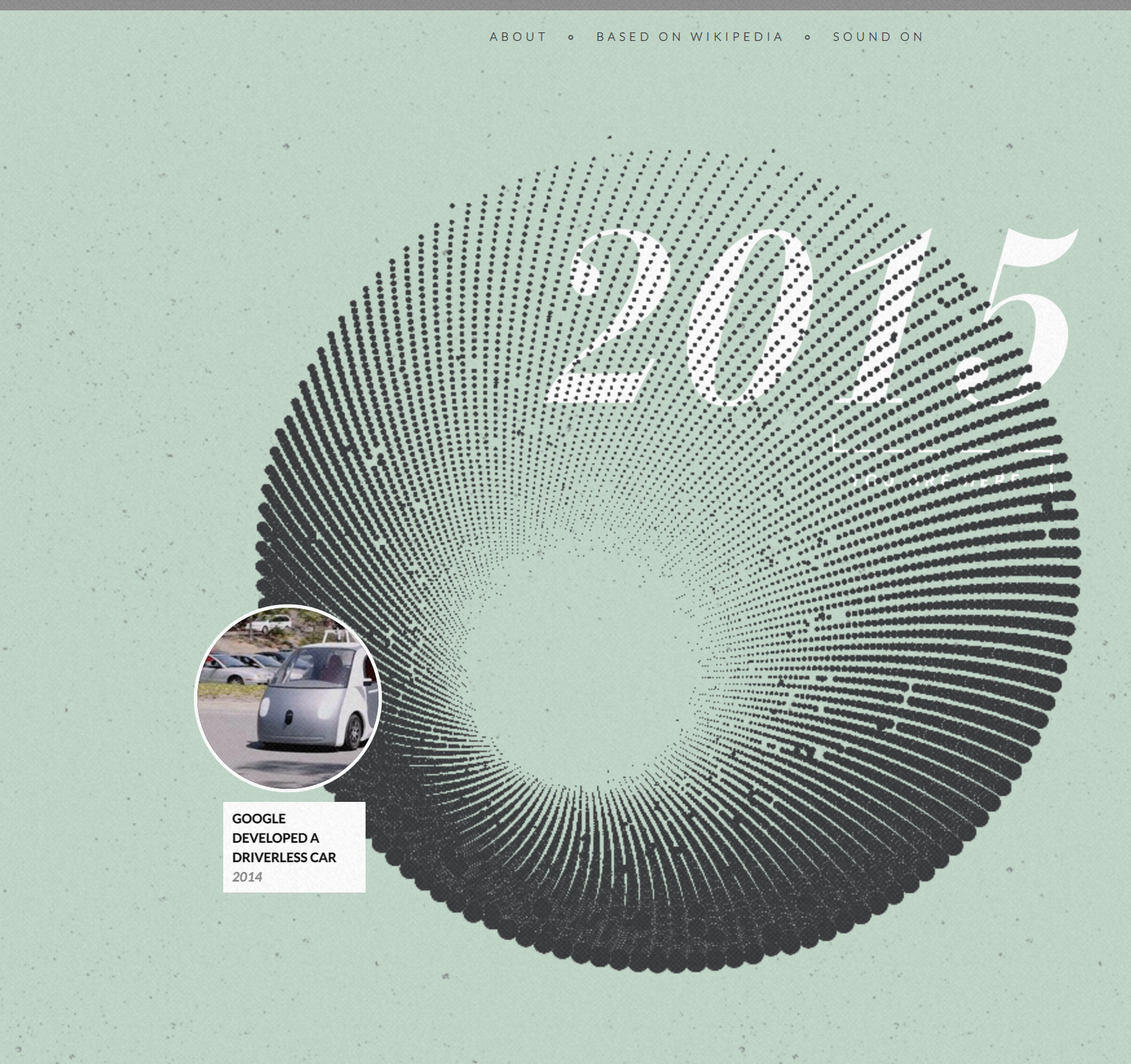


more stuff like it on this page
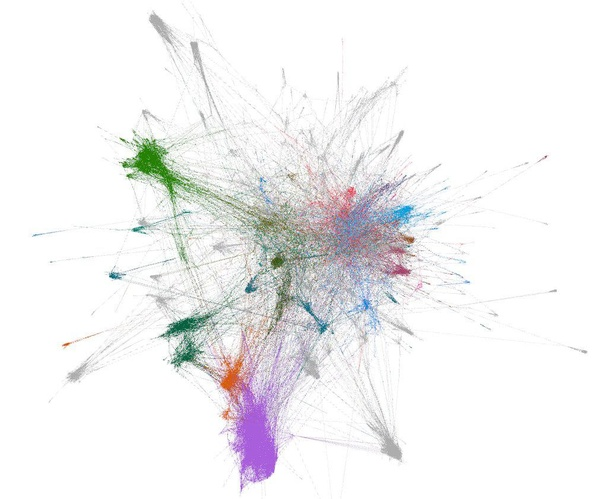
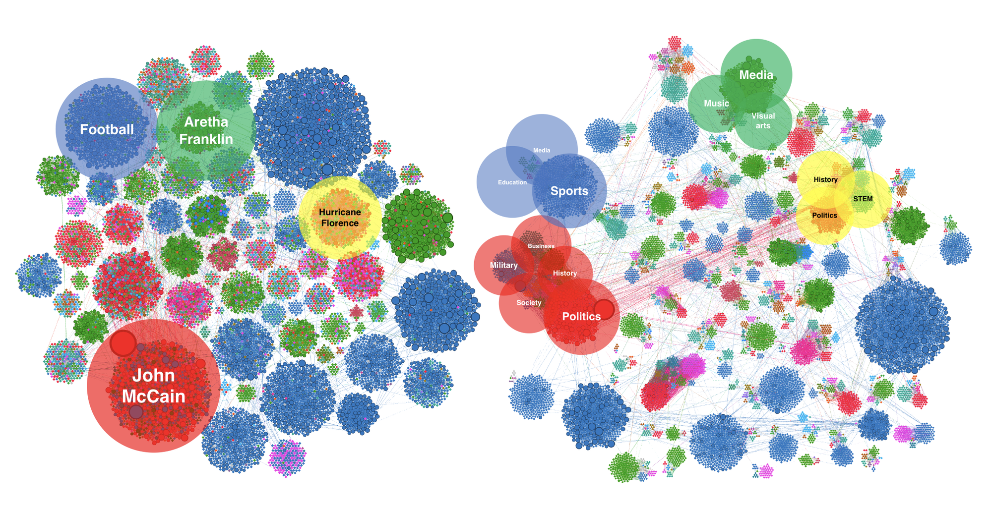
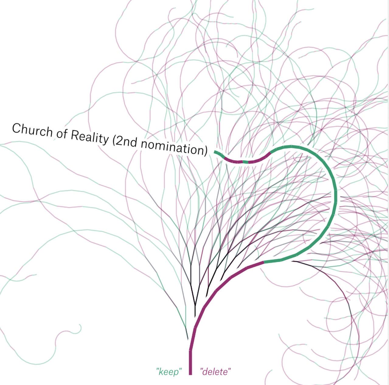
Graph Visualization of Wikipedia
 Axel Nilsson
Notabilia
Visualizing Deletion Discussions on Wikipedia
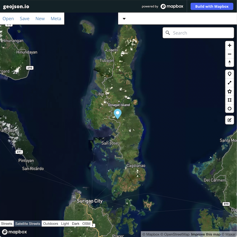
WikiGalaxy
3d relationship graph of wiki pages
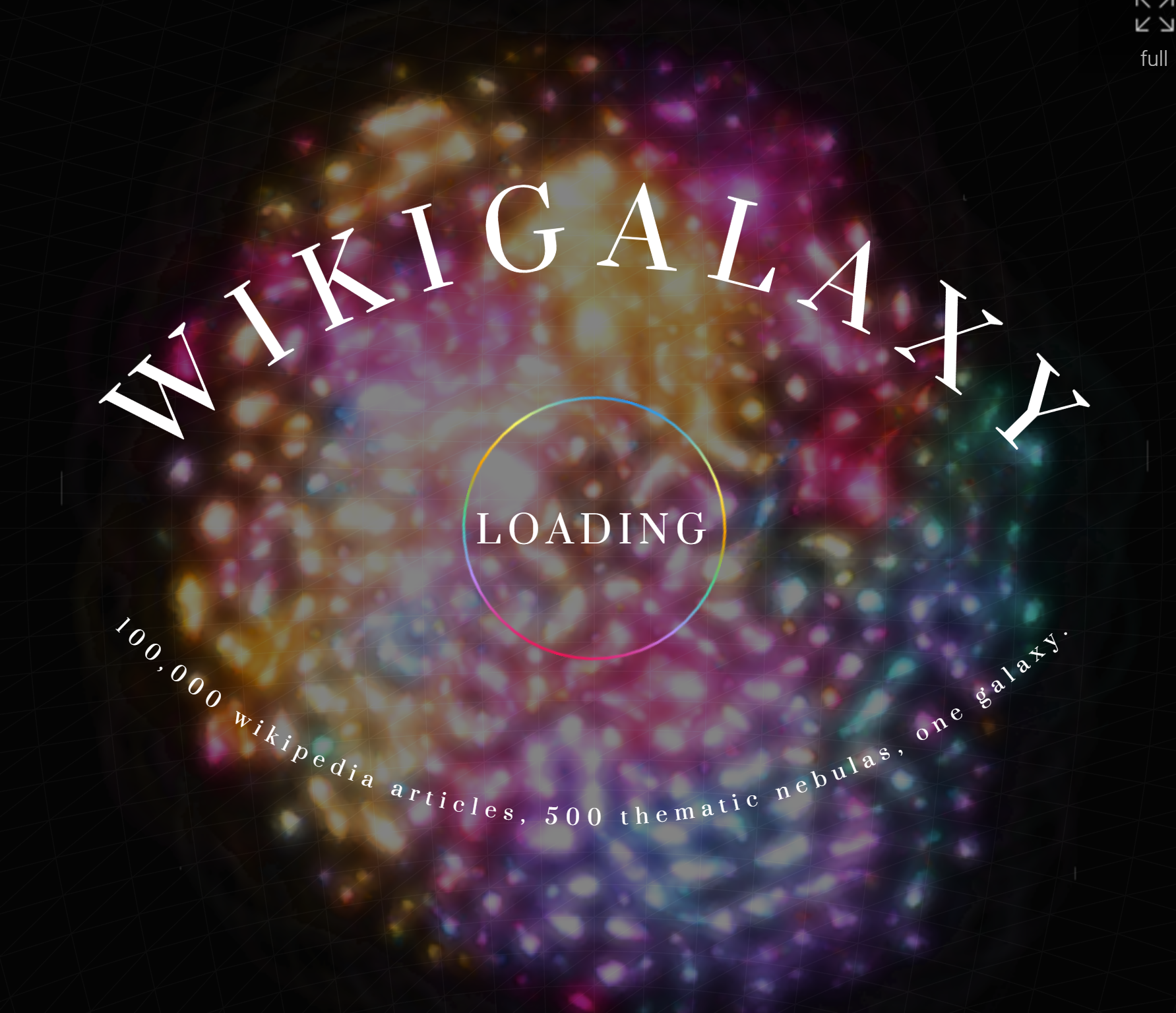
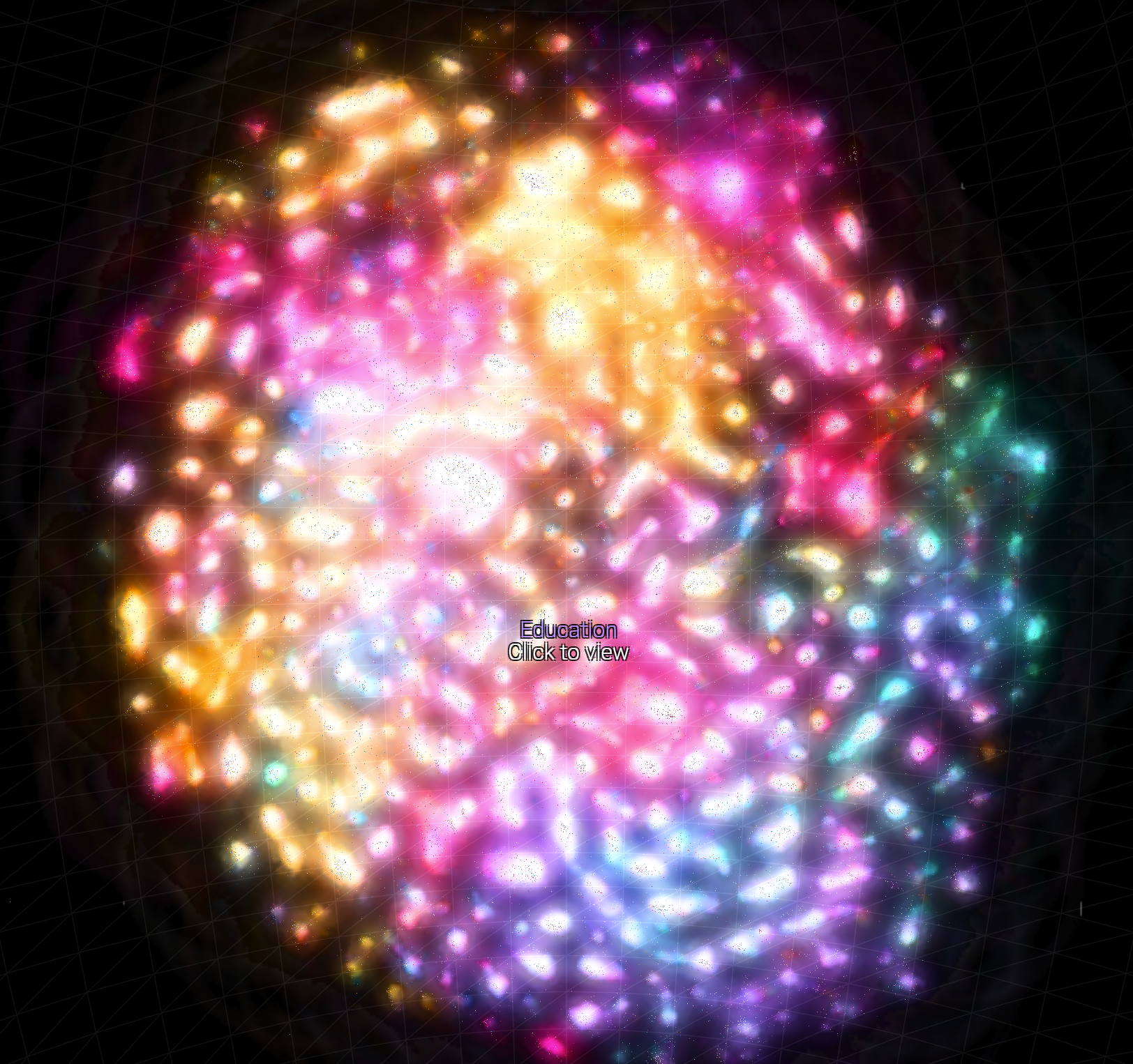
every dot is 1 wiki article!

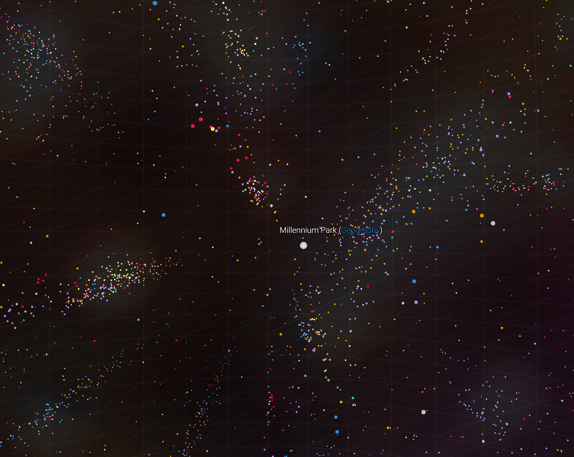
note takes like 3 mins to load, worth the wait
Tera Incongita

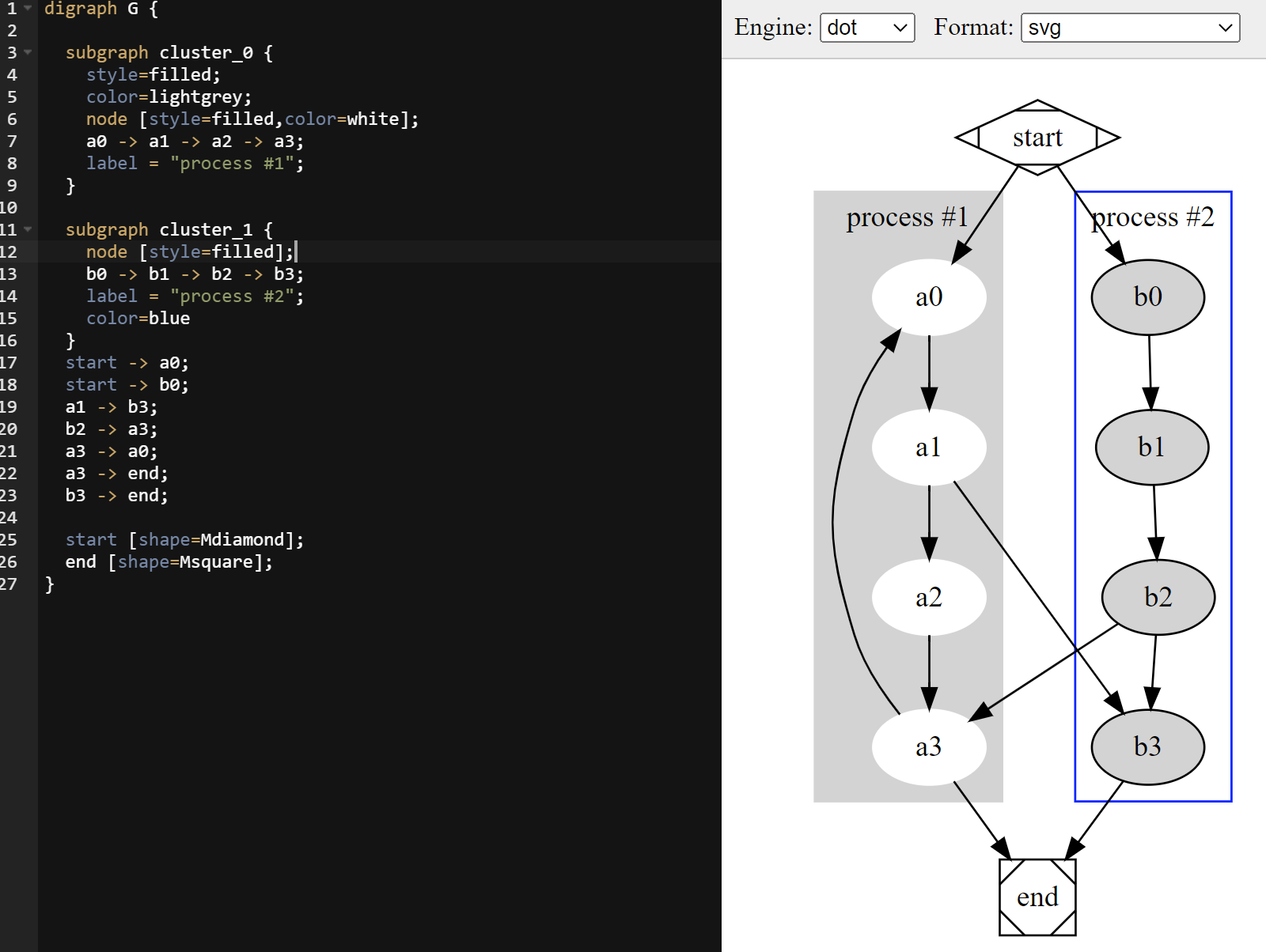
Graphviz Online
cool tool for creating graphs via code. someday ill learn how to use it😉🤞
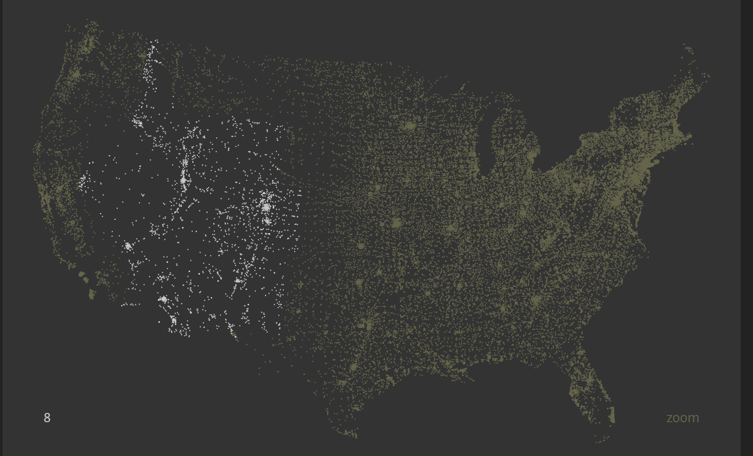
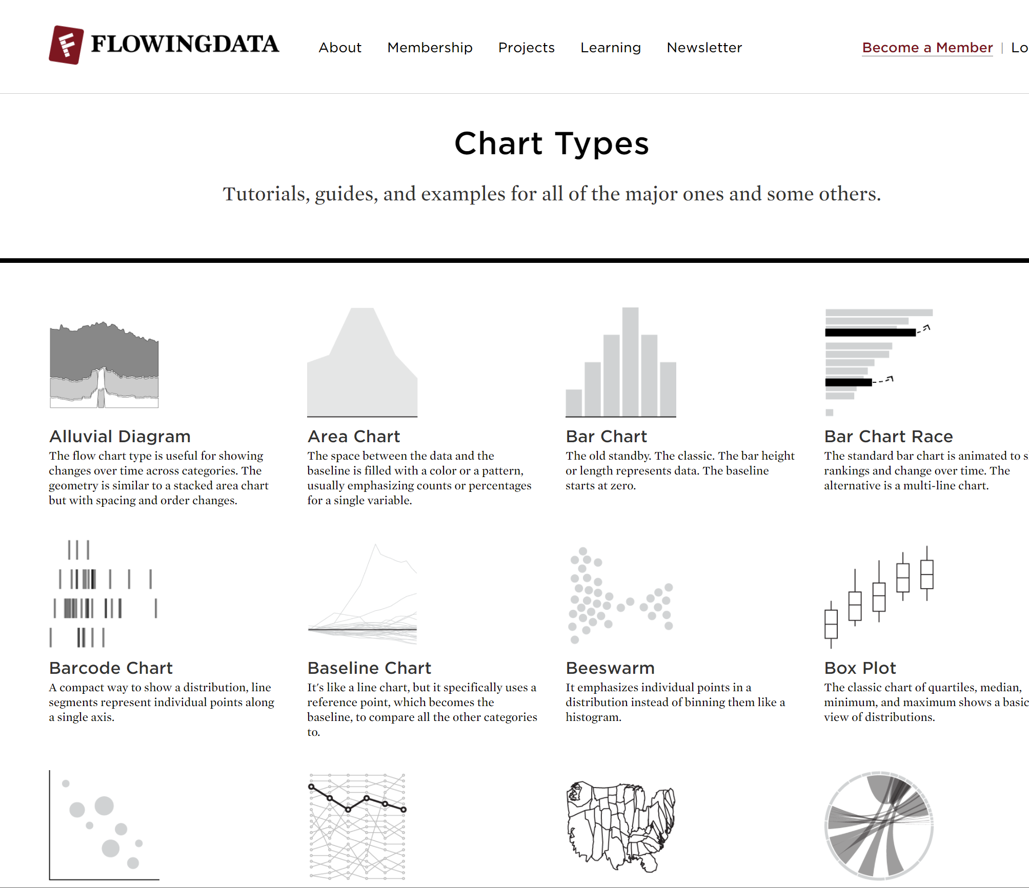
Flowingdata
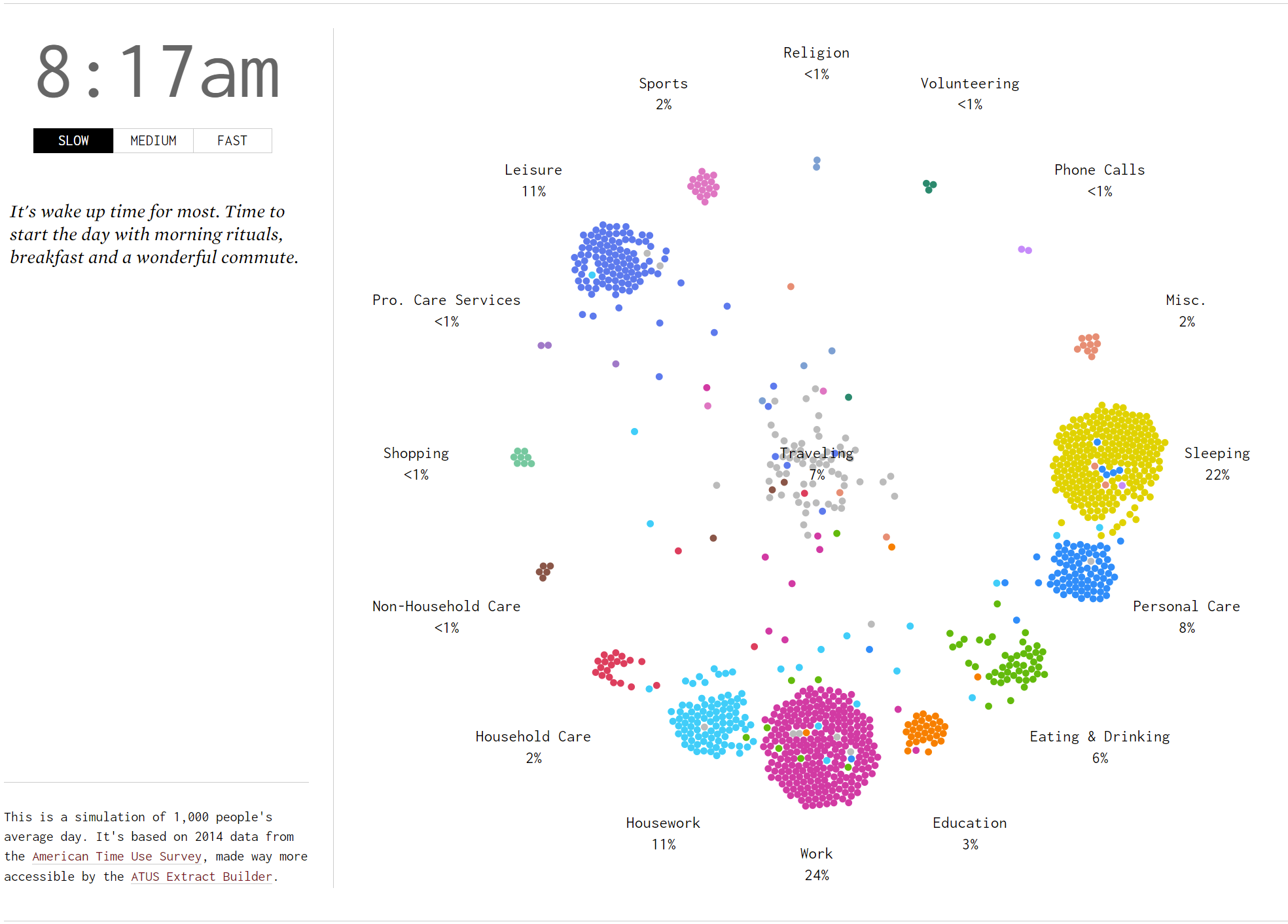
A Day in the Life of Americans
Found by Katherine B. thank you!
This is a cool visualization of the "American time use survey" which records what people do with their time during a day.
Flowing data has alot more cool graphs and stuff!
Search by graph type!
Chart Types | FlowingData
amazing gps point rendering too. supports thousands of points best ive found!
ive used this one to graph the gps data from my phone. that has thousands of points. havent found any other software that supports so many points and is easy to use.
great gpx offline editor created by the openstreetmap people
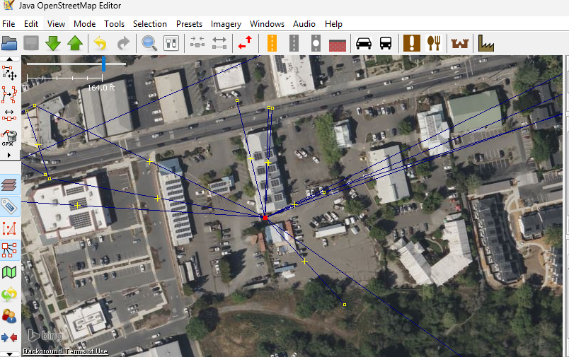
how to use the tool

on windows 11 had issues with the .exe
so had to use microsoft store :/
Thanks for reading!
Email me if you want to add any cool tools not listed here!

Author
by oran collins
github.com/wisehackermonkey